Shindig at Baker Bridge!

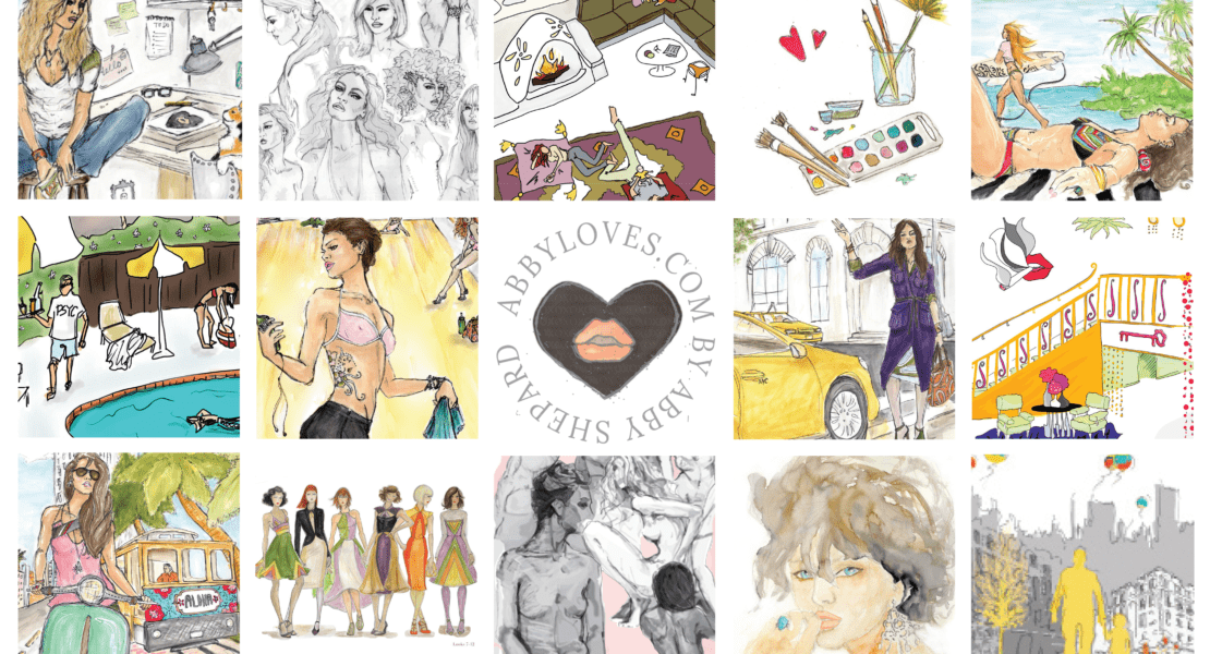
A behind the scenes look at the evolution of The Food Project’s custom illustration for their annual fundraising event, the ‘Shindig at Baker Bridge‘.

PROJECT DATE: SP/SM 2023

PROJECT DETAILS:
Custom Illustration for the nonprofit organization, The Food Project’s Annual Fall Fundraising Event, the ‘Shindig at Baker Bridge’, to be used as their Save the Date Postcard, Formal Invitation & Silent Auction item.

CONCEPT DISCUSSION:
This spring I had the good fortune of being introduced to Myriam Michel, by a good friend and client, Nicole Guilmartin. Both ladies happen to be rock star event producers in the Boston area, and Myriam was looking for a custom illustration for a party invite. She’d seen an illustration I’d done a few years back for the The Power of the Purse Gala (a much cherished piece to this day) and the vision of that ‘lovely lady’ had stayed with her. So, when the opportunity arose, she gave me a call and I couldn’t have been more pleased to make her acquaintance!

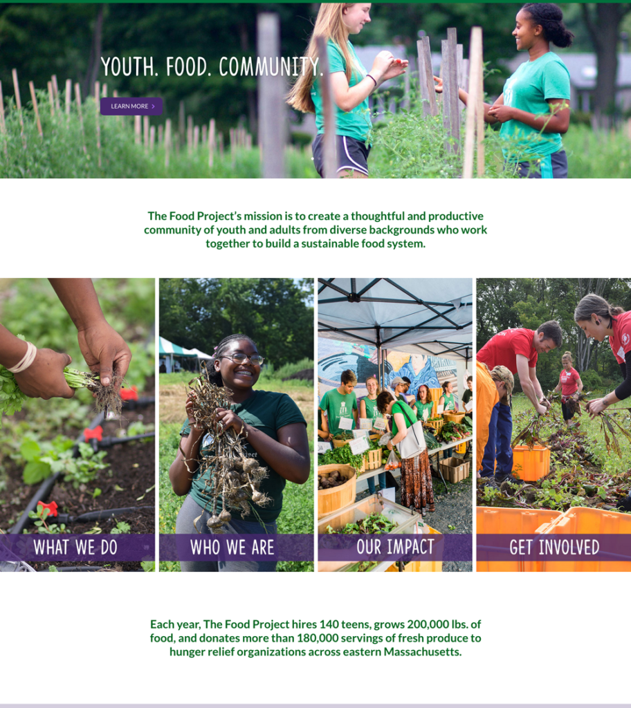
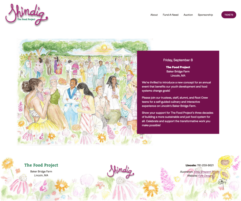
The image would be used for a Save-the-Date & Formal Invitation for The Food Project’s re-imagined fundraising event, the Shindig at Baker Bridge, and would take place at Baker Bridge Farm this September in Lincoln, MA. This event raises money to benefit their youth development and food systems change goals. In other words, it helps provide healthy fruits and vegetables to families and communities – while also offering educational food programs to teens. Amazing! I was thrilled to be a part of the team.

She described her vision of the event, and it began to take shape in my mind. I pictured a lively garden party surrounded by fields and flowers with a gathering of warm, welcoming faces in a celebration of bountiful nature on a dreamy, sunny afternoon. Laughter and frivolity, along with meaning and purpose. A setting both casual yet festive to showcase the farms beauty, while also capturing guests mingling, sipping libations, noshing small bites, exploring the property, and an overall joyful atmosphere of community. I could see it coming to life.

She looped Heath Marlow, Director of Director of Donor Engagement for The Food Project into the conversation, and from there things really took off. With everyone familiarized, the last thing to do before putting pencil to paper, was to make sure I had the details right; to extrapolate what was inside their minds – which is really the most important part of creating a custom piece for anyone. Getting that on point takes some Q&A at the start, but always makes the work so much better.

COLLABORATION:
So much happens at the front-end of a project. Playing detective and being highly curious is part of the fun – and I loved working with both Heath & Myriam to uncover their vision. They’re wonderful collaborators – positive, enthusiastic and open to sharing – which makes everything easier!

I was curious to know everything… Did they see the setting from a distance, like an aerial view of the party or was it close-up and cropped in on faces/details? Did they want iconic, notable, and realistic details included from the farm or was it to be more abstract to capture more of the ‘idea’ of the location? What time would the party be (day/night/dusk)? Would it be families, small children, farm animals – or is it more of an adult social event sans children or animal attendees? What would be some of the party details (food/wine/attire/décor)? And finally – who were their guests? What might they they be wearing and who is part of their community? How would the piece of art be used – print, digital, postcard or other? And at what size?

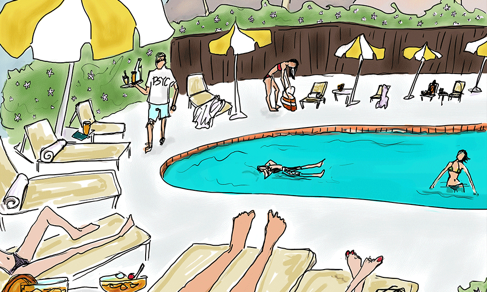
They visualized a lively afternoon party taking place on the farm seen from a distance in a wide open space surrounded by rows of crops, flowers, trees – perhaps a few iconic pieces from the farm like a large tree and wooden bench, in lush green tones on a sunny day to include a party tent, tables, some hints of food/wine and perhaps children and other fun, farm details. I loved it and with all the questions answered, the first-round of sketching was underway.

CONCEPT SKETCH #1

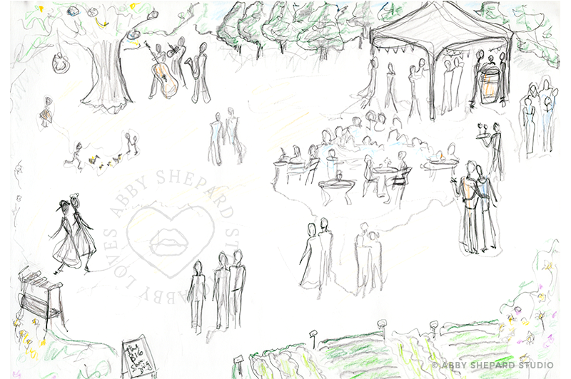
Before making the first mark, I researched the farm and any images I had as reference. I searched for farms and garden parties that I thought mirrored the idea. I sat in the garden outside and watched the light and considered the space and color with eyes closed and began to really envision what should be on the page.

The initial sketch usually looks pretty rough and messy, but there’s a lot of work that goes into it. It’s meant to be a map that merely suggests what’s to come. I shared it with Heath & Myriam to see if this was similar to what they were picturing (the view of the farm, the people and details, children chasing ducks, the wooden bench, etc) to makes sure I was on the same page with them before moving on. And it turns out, I wasn’t.

Upon seeing the sketch, they realized they had something different in mind. They their words, they were looking to ‘see a more zoomed-in version, prioritizing the energy of the people over the physical location‘, yet with the same party details and farm setting. They wanted to steer clear of anything specific to the farm, to stick with more of a general farm setting, while making sure to include teens but no small kiddies or duckies. Perfect! Moving onto the next version…
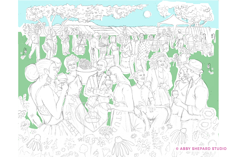
CONCEPT SKETCH #2

Changing the composition could have been significant, but we were clear on most of the details so it was just a matter of changing the perspective to have a closer view. With some subtle shifts in the placement and composition, the next version came to be. And it just felt right.

But before I could celebrate, Heath & Myriam would need to confirm it. And they did.

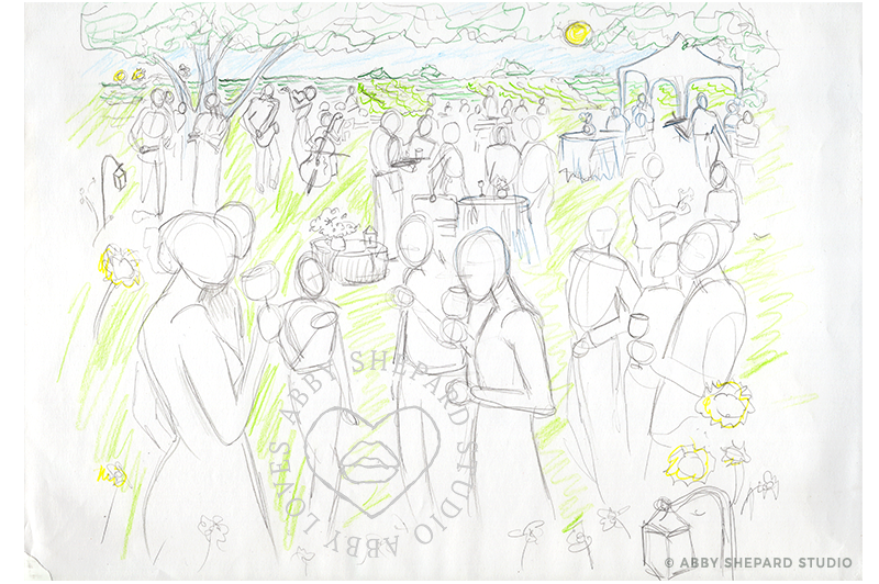
When I shared the 2nd version, they loved it. And yay! This sketch was more flushed out than the first to show more detail to the setting and guests – and I was so happy that they were also fans of take two. There was something so inviting about it. It really pulled you in while carrying your eye around the people and the party details. I couldn’t wait to get started on filling in the missing pieces and taking this to the next level.

Who would each person look like? What would they be wearing? Would they be holding a glass of wine, or each other? What types of flowers, tables, lanterns, trees? So many options to play with! And with the green light of approval, I could begin sketching.

Heath shared, “I even love how you’ve got the sun low in the sky, as I suspect that will lend to the kind of colors that help people imagine a late afternoon/early evening event in September.“ Which honestly I had not even thought of yet since I was so focused on getting the line drawing right. I had a loose idea for color, but I get to that later, so his mention of it was gold. It helped me see it through his eyes and gave me another piece to the puzzle.

We all agreed it should be super colorful but not only with the environment, but also in skin tones, with a variety of textures and styles. And they wanted to include a representation of young adults and people of all abilities with guests attire being a mix of sundresses, summer suits and upscale, yet casual attire – A farm-fancy, garden party!

INSPIRATION

There was so much to choose from and I wanted to incorporate as much as possible. In skin tones and hair, I wanted a wide range of hues from black, brown, and copper, to red, sand, peach, mustard and nude.

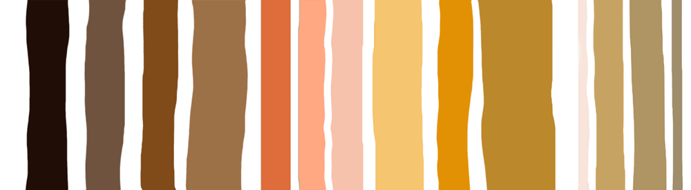
And for the setting, I wanted lush, deep greens in a range of tones from evergreen to teal – and lots of vibrant colors like magenta, violet, sunflower and cyan to really offset the background and make it pop!

But before I could do anything with the color palettes, I needed to get a drawing done.

ARTIST DESIGN NOTE
This turned out to be a particularly fun project with more variations than I normally would do. It’s fascinating to share the transition of this composition to show how much it changed from start to finish – while so much of the initial concept staying intact. In the end, it’s even a surprise to me how the ‘happy accidents’ are really what make this piece truly special. Little creations tend to have a life and personality of their own that play a part in their own evolution to get where they need to be. It’s a magical mystery. See if you can find the changes as you scroll through. I’ll give you a hint… it’s the guests.
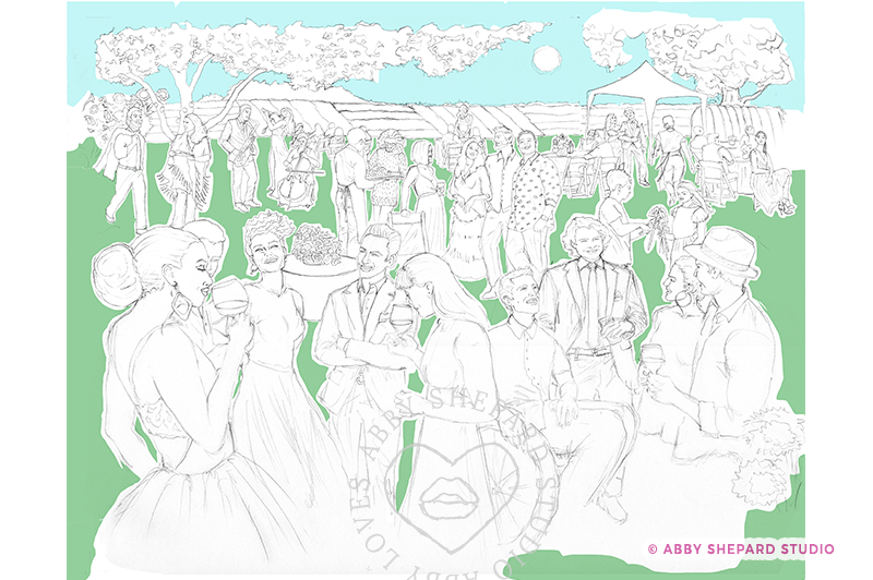
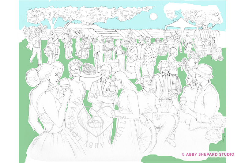
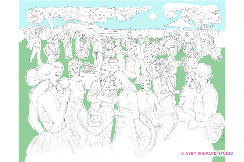
COMP #1

COMP #2

COMP #3

COMP #4

COMP #5 – FINAL VERSION

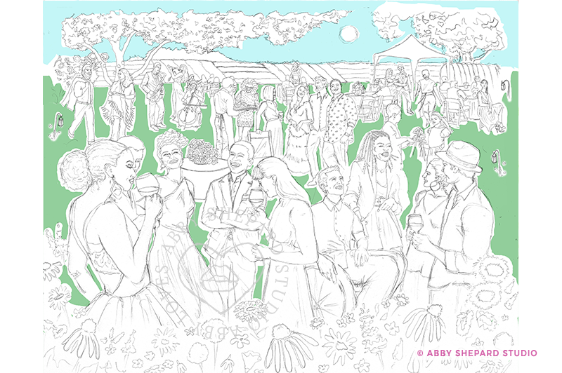
PROGRESSION OF COMPS

What you’ll notice as you view the comps is the people change or move around. I prefer to work in traditional media because of the feel of pen to paper, and how it’s a very meditative and pure experience for me. Free of distractions, notifications, pop-ups or screens. However, being able to work digitally, is a saving grace and one that is quite liberating. Knowing that I don’t need to be perfect, that I can change pretty much anything I want to is freeing and it allows me to really let go and play with the process.

In the 1st Comp, I wasn’t crazy about the grouping so I replaced a gentlemen in the front in the next version, Comp 2. But then I thought the other grouping was off, so I replaced a guy with a very happy lady. But then, she wasn’t quite right either, so I replaced her with a different woman who I thought was fabulous and really added something strong to the composition. And then received a request for ‘braids’ from Myriam which turned out to be exactly what was missing… a new hairstyle. Who knew?! But it sealed the deal and the drawing was done!

THE FINAL VERSION IN COLOR

Well here she is in all of her colorful glory and there’s so much to talk about. I want to fall into this picture and get to know everyone. Walk around the beautiful field while listening to the musical trio. Feel the warm, setting sun on my face while hearing laughter and friendly conversation. Sip some wine with the wafting aroma of wildflowers all around me as I admire everyone around. How dapper they all look and what style. They’re all so interesting and inviting!

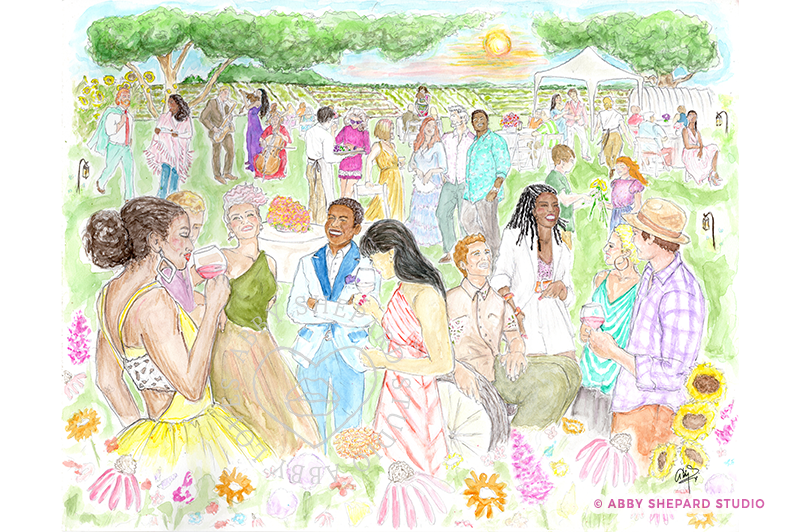
I want to be there! Usually when I draw something, it’s not a real place you can go, but this time, it actually is. How amazing is that. This party will be happening on Friday, September 8th at the Baker Bridge Farm in Lincoln, MA. I’ve included a link to the event page below and I highly recommend you check it out if you’re not familiar with this essential nonprofit organization, The Food Project. They’re doing great things and paying it forward.

If you can’t attend, you can support them in other ways by making a donation or better yet, bidding on one of their silent auction items in honor of the event. They’ll be offering a limited amount of these prints on beautiful museum quality watercolor paper, that I’ll be customizing by hand so each is an original, one of a kind piece for your collection. Each will come with an artists statement of authenticity, and a private note thanking you for your support of The Big Shindig. I hope to see you there!

Get in touch if you have any need for a custom illustration for an upcoming event, an invitation or if you’re interested in a custom print or piece of artwork. I’m always open to collaborate on a new project.

Feel free to leave any comments – would love to hear what you think!

Continue Reading

Well Hello 2020!!

2020 is here…. “Are you ready?” Well come along and get ready with me! As I plan for the coming year – I’m thinking about what I missed this past year, what I want to do in the next twelve months, and how I want to FEEL when I look back on the year come next December. You know what I’m talking about…. getting sh@t done!

Today brings with it renewed fire people! Ya, I know… we didn’t all wake up to a different world (eyeroll… sigh) but here’s to inspiring yourself and planning the year ahead with positive vibes! You with me?!

I love searching for good advice, so I looked around the wonderful web-wide-world and found the best advice for ME in the coming year – and am sharing it here with YOU.

In the spirit of new beginnings and fresh starts, here are seven things to consider as 2020 begins.

1. Enjoy Your Resolutions.

Resolutions don’t have to be about doing stuff you don’t enjoy. Don’t make it seem like work. Make it fun by staying focused on the things you LOVE and want to do more of. I love to collaborate, create and share… so I’ll be doing more of that – along with breaking a sweat, purging my clutter to make room for new things, sipping cocktails with friends, and dancing like a fool!

2. Set Goals that Inspire.

I’ll be setting some goals that tap into my passions. Maybe some aerial dance or yoga for me this year. Make it something that inspires you and makes you happy!

3. Take a day off. No really… a whole day.

I love this one because unplugging and disconnecting from all the ‘noise’ around me is when I really discover random, unforeseen happiness. It’s also usually when my best ideas come to me. See if you can spend at least one entire day (yes, 24 hours) without being attached to a device. Put the tech down people and lift your head UP to spend real time with pets, friends, family, or just yourself. You’re pretty good company when you don’t have your face stuck in a screen. I’ll be making time to hear my inner voice and learning to actually listen.

4. Celebrate Victories.

Even if you had a tough year, there were definitely things you accomplished when you were at your best… things that came together in just the right way. This is so true for me. I’ll be reviewing my year, writing down the things I accomplished and recalling how good they made me or others around me feel. Then I’ll drink a toast to what made me most proud!

5. Reframe Failures. Oh Ya!

Even if it was a fantastic year, there are always things that didn’t go exactly as planned. I’ll be reflecting a bit on what I learned, what mistakes I might avoid in the future – or just considering how I might do it differently next time around. Maybe this was just a practice run for the real deal coming down the road in the future… and drink another toast to that!

6. Be Thankful. Do It!

Taking time to be thankful. Unless you’re a recluse and never see anyone, you’ve probably had a bunch of people help you this year, sometimes because it’s their job, but sometimes just because they care and they can. I plan on thinking about those people and making a list of how they helped me… no matter how small. I’ll be writing small notes, sending a card, giving a token of appreciation – whatever I can to make it personal and genuine. Take time to thank people properly because they deserve it. It will make YOU and THEM feel good. I always have the best of intentions with this particular goal but seem to get distracted or overwhelmed by what the ‘thanks’ should be. This year, I’m gonna keep it simple and just pick one and DO IT!!

7. Give a Gift.

Give an anonymous gift to something/someone you care about without any accompanying obligation – that’s right, no need for a return ‘thanks’. Find joy in being someone, or something’s, savior. My soft spot happens to be animals – ANY KIND OF ANIMAL! Those furry little friends that make us feel so loved no matter what, they’re always there when we need them (with zero judgment), and give us so much happiness by just tilting their head. The MSPCA will be getting some extra attention in the coming year from ME! Maybe I’ll become a foster momma for this guy…

(Inspiration & advice via Inc)

I also love this roundup on ‘Ways to Support Your Well-Being in the New Year‘ by Harvard University’s Harvard Magazine.

Don’t be shy… leave a comment and share your own favorites!

Continue Reading

Power of the Purse!

Custom Illustration for Brookview’s Annual Fundraising Gala, ‘Power of the Purse’ 2020 Invitation.

PROJECT DATE: Fall 2019

PROJECT DETAILS:
Custom Illustration for the nonprofit, Brookview’s Annual Fundraising Spring 2020 Gala Event, ‘Power of the Purse’, to be used on their Save the Date & formal Invitation.

CONCEPT DISCUSSION:
This is Brookview’s 5th annual Power of the Purse event. They’re also celebrating their 30th Anniversary this year so instead of a luncheon they’ll be hosting an evening gala. How fun!

They let me know they were looking for a custom illustration that was stylish and modern, yet urban and universal. I was thrilled to take this on since I’d been actively looking for ways to add a bit more diversity into my portfolio so this job was a win win for everyone!

COLLABORATION:
Nicole Guilmartin is the event planner working with Brookview for the upcoming fundraiser. She also happens to be one of my favorite people, top client’s and best gal-pals. Nicole recommended me to Brookview when they were looking over the past years’ invites (“big thanks NG!”). She took them to my fashion portfolio and sorted through some of my sample work. They picked out a few of my pieces they were particularly drawn to and then got in touch to discuss their needs. They offered some helpful direction – like wishing to incorporate the logo colors and wanting a more ethnic personality – but then they gave me free range to create what I thought would work best.

INSPIRATION:
I immediately had a vision of a strong, confident lady casually strutting down an ‘any city’ staircase surrounded by classic, clean architecture with some trees in the distance while she carryied a big, bold, beautiful bag. Brookhaven’s logo is primarily green, orange and red so working those colors into her outfit and background was pretty easy. I played with some variations of yellow, coral and brown to add an interesting dynamic to the color palette. While I also liked the idea of a cool, icy blue to play off all the warm tones. Brown, peach, green, yellow, red and a hint of blue became the final palette.

INSPIRATION:

I had so much fun finding reference materials to use. Here’s a Style-Board I created that really set the mood of what I was looking for. A confident, strong, easy-going personality that showed great energy surrounded by leopard print, flowing, pleated fabric, and warm, bold, vibrant colors. Don’t you just love that FACE!!

CONCEPT SKETCH:
I sketched out a wide staircase with a traditional-style building with curved architectural details and windows. I placed a pretty bonsai-esque tree in the far distance. Then came the best part – crafting my vision for this special lady. Now for the outfit! I loved the idea of a swaying, pleated maxi-skirt in a bright color, a simple white top, flowing full hair, decorative jewelry and shoe/bag styles that incorporated leopard print. (Keep an eye out for a follow-up post where I’ll share all the ‘real product’ inspiration used for this lovely). Once I had her complete style in my sights, I worked her into the scene. Then came a gray scale composition to guide me through placing the color perfectly.

COLOR COMP:

I’m a pretty impatient artist when it comes to getting to a final project. Don’t get me wrong… I take lots of time spinning designs in my head and testing out different options to make sure I’m bringing the best idea to the table. But I’m like Nicole in the way that once I have that vision in my head for the final design… I want to get it done! It’s probably why I love doing up a messy, rough color-comp once I’ve got the pencil sketch and linework done. Sometimes I have a fondness towards these little imperfect pieces more so than the polished final design. This one is particularly sweet since it’s just colored pencil and show’s a lot of texture and personality.

FINAL DESIGN:

I love this illustration for so many reasons. Truth is… no matter how clear the vision in my head is when I start working on a concept, it always evolves during the process. In the end, what I create is usually a bit of a surprise to me as well. There many subtle ways the image takes it’s own shape – which is always pretty exciting. Even though I envisioned her to be bold, and confident, and carefree – I had no idea of how she would ultimately look. Upon adding the final touches to this fabulous lady, she has done me proud beyond my wildest expectations. Her sassy, stylish vibe combined with her intelligent, strong, comfortable presence makes her a true beauty to be added to my collection. It’s so nice to meet you Gala Gal!

Get in touch if you have a custom illustration needed for an upcoming event, invitation or if you’re interested in a custom print. I’ll be adding a second version of this illustration with more detail in the background to make for a better balanced composition for a standalone art print.

Feel free to leave any comments – would love to hear what you think!

Continue Reading

Create Gallery Cocktail Menu

Here’s a glimpse of a custom menu designed for the recently opened Create Gallery + Cocktail Lounge. This is an amazing new gallery located in Somerville’s Bow Market that features a rotation of exhibits by local artists and hosts 8 cocktails on tap created by favorite area bartenders. If you haven’t heard of it you should definitely check it out!

When these guys contacted me about this design project, they new they needed something for their new gallery & lounge but weren’t quite sure what. After talking through their initial thoughts – wanting some type of marketing handout that summed up their services that captured their cool vibe – it was time to brainstorm some concepts. They didn’t have any marketing materials designed yet to work off for style so I had to design something from scratch that they could then use to build other future marketing pieces off.

Design Concept

I decided to go with a double sided rack card for the menu. It’s easy to display, carry and offered the right amount of space for what they needed. I drafted an initial outline of what should be included for info and then moved on to the fun stuff – color, design elements, and images! The space has a rich, vibrant wall color of deep terracotta and the logo is a medium toned warm blue – these were such great colors to work with. I used tones of deep to medium orange mixed with medium to deep blues for the palette.

Art Direction & Imagery

CG+CL had a collection of photos but for the marketing piece to be perfect, we needed to get some serious shots from a professional. While designing the layout for the brochure I found several place holders that worked as samples for the final piece. I recommended they do a photo shot with a photographer of their choice and supplied them with a shot list… a potential wish list of things we could use for the brochure, but also that they could use in the future. Their photographer did a killer job getting the images we needed to capture their style while making the menu really POP!

Custom Background

I wanted to add some texture and pattern into the background and since this was a cocktail bar, I figured what could be better than some hand drawn cocktails scattered about. I loved the dramatic element that the textured pattern offered and in the end, it all came together perfectly!

Final Design

I loved doing this brochure – not only because it’s a cool new indie biz that showcases local art and serves tasty cocktails – but also because it allowed me to use a variety of elements to create something unique for them that they really needed and how well it showcased what they have to offer.

Continue Reading
1 2 3 27