Custom Illustration for Brookview’s Annual Fundraising Gala, ‘Power of the Purse’ 2020 Invitation.
PROJECT DATE: Fall 2019
PROJECT DETAILS:
Custom Illustration for the nonprofit, Brookview’s Annual Fundraising Spring 2020 Gala Event, ‘Power of the Purse’, to be used on their Save the Date & formal Invitation.

CONCEPT DISCUSSION:
This is Brookview’s 5th annual Power of the Purse event. They’re also celebrating their 30th Anniversary this year so instead of a luncheon they’ll be hosting an evening gala. How fun!
They let me know they were looking for a custom illustration that was stylish and modern, yet urban and universal. I was thrilled to take this on since I’d been actively looking for ways to add a bit more diversity into my portfolio so this job was a win win for everyone!
COLLABORATION:
Nicole Guilmartin is the event planner working with Brookview for the upcoming fundraiser. She also happens to be one of my favorite people, top client’s and best gal-pals. Nicole recommended me to Brookview when they were looking over the past years’ invites (“big thanks NG!”). She took them to my fashion portfolio and sorted through some of my sample work. They picked out a few of my pieces they were particularly drawn to and then got in touch to discuss their needs. They offered some helpful direction – like wishing to incorporate the logo colors and wanting a more ethnic personality – but then they gave me free range to create what I thought would work best.
INSPIRATION:
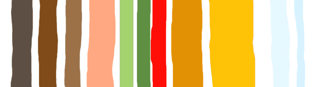
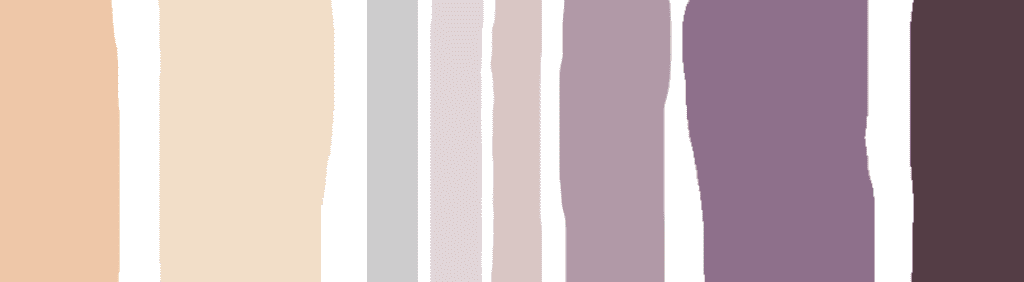
I immediately had a vision of a strong, confident lady casually strutting down an ‘any city’ staircase surrounded by classic, clean architecture with some trees in the distance while she carryied a big, bold, beautiful bag. Brookhaven’s logo is primarily green, orange and red so working those colors into her outfit and background was pretty easy. I played with some variations of yellow, coral and brown to add an interesting dynamic to the color palette. While I also liked the idea of a cool, icy blue to play off all the warm tones. Brown, peach, green, yellow, red and a hint of blue became the final palette.
INSPIRATION:
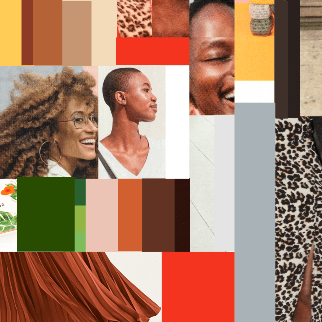
I had so much fun finding reference materials to use. Here’s a Style-Board I created that really set the mood of what I was looking for. A confident, strong, easy-going personality that showed great energy surrounded by leopard print, flowing, pleated fabric, and warm, bold, vibrant colors. Don’t you just love that FACE!!
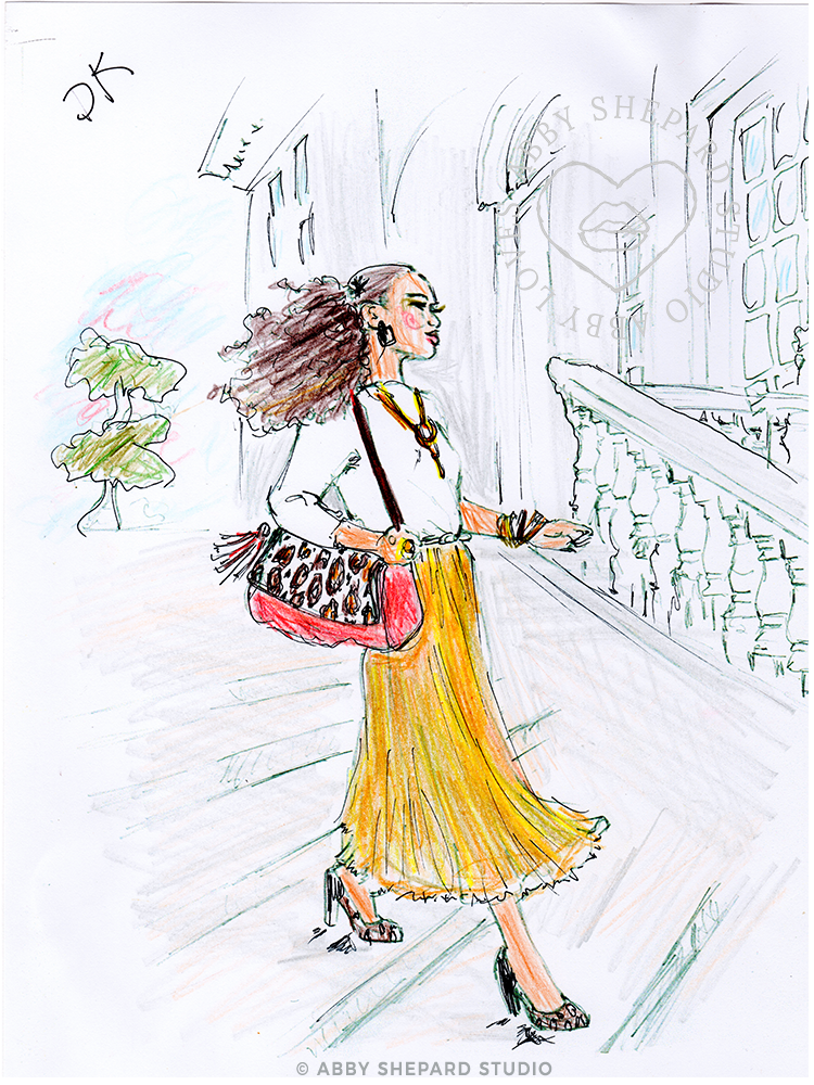
CONCEPT SKETCH:
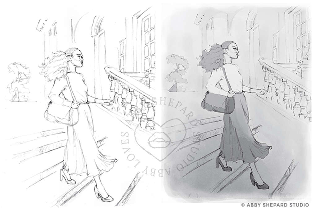
I sketched out a wide staircase with a traditional-style building with curved architectural details and windows. I placed a pretty bonsai-esque tree in the far distance. Then came the best part – crafting my vision for this special lady. Now for the outfit! I loved the idea of a swaying, pleated maxi-skirt in a bright color, a simple white top, flowing full hair, decorative jewelry and shoe/bag styles that incorporated leopard print. (Keep an eye out for a follow-up post where I’ll share all the ‘real product’ inspiration used for this lovely). Once I had her complete style in my sights, I worked her into the scene. Then came a gray scale composition to guide me through placing the color perfectly.
COLOR COMP:
I’m a pretty impatient artist when it comes to getting to a final project. Don’t get me wrong… I take lots of time spinning designs in my head and testing out different options to make sure I’m bringing the best idea to the table. But I’m like Nicole in the way that once I have that vision in my head for the final design… I want to get it done! It’s probably why I love doing up a messy, rough color-comp once I’ve got the pencil sketch and linework done. Sometimes I have a fondness towards these little imperfect pieces more so than the polished final design. This one is particularly sweet since it’s just colored pencil and show’s a lot of texture and personality.
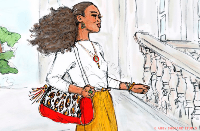
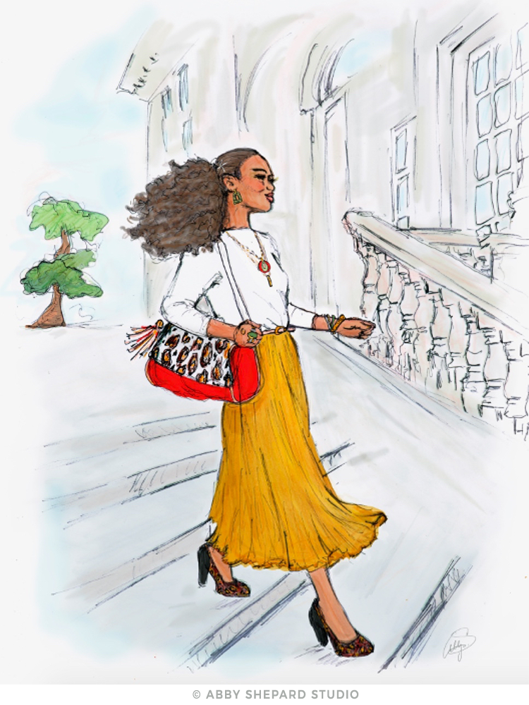
FINAL DESIGN:
I love this illustration for so many reasons. Truth is… no matter how clear the vision in my head is when I start working on a concept, it always evolves during the process. In the end, what I create is usually a bit of a surprise to me as well. There many subtle ways the image takes it’s own shape – which is always pretty exciting. Even though I envisioned her to be bold, and confident, and carefree – I had no idea of how she would ultimately look. Upon adding the final touches to this fabulous lady, she has done me proud beyond my wildest expectations. Her sassy, stylish vibe combined with her intelligent, strong, comfortable presence makes her a true beauty to be added to my collection. It’s so nice to meet you Gala Gal!
Get in touch if you have a custom illustration needed for an upcoming event, invitation or if you’re interested in a custom print. I’ll be adding a second version of this illustration with more detail in the background to make for a better balanced composition for a standalone art print.
Feel free to leave any comments – would love to hear what you think!