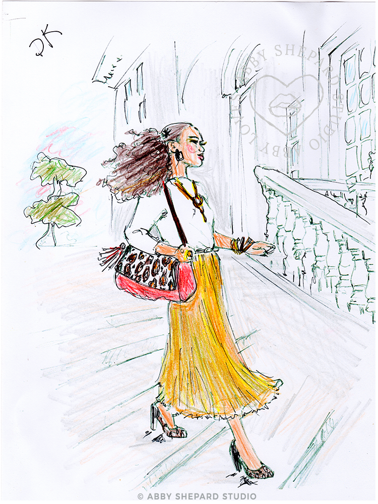
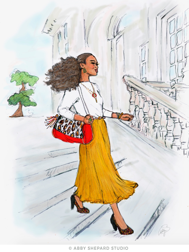
A behind the scenes look at the evolution of The Food Project’s custom illustration for their annual fundraising event, the ‘Shindig at Baker Bridge‘.
PROJECT DATE: SP/SM 2023
PROJECT REDO: SM/FA 2024
PROJECT DETAILS:
Custom Illustration for the nonprofit organization, The Food Project’s Annual Fall Fundraising Event, the ‘Shindig at Baker Bridge’, to be used as their Save the Date Postcard, Formal Invitation & Silent Auction item.
CONCEPT DISCUSSION:
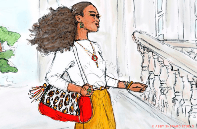
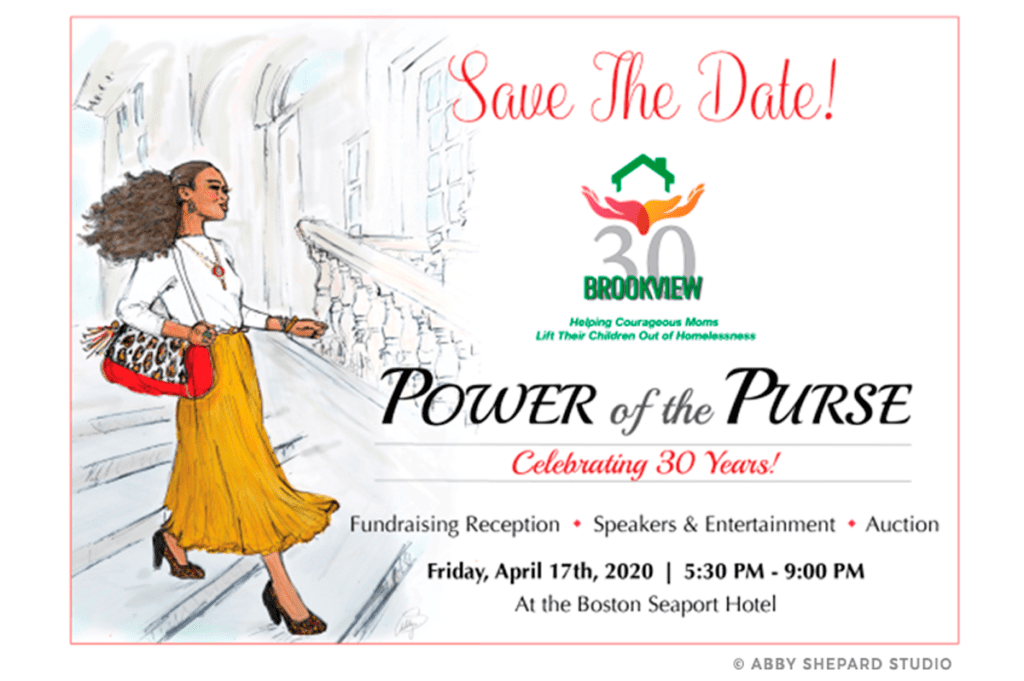
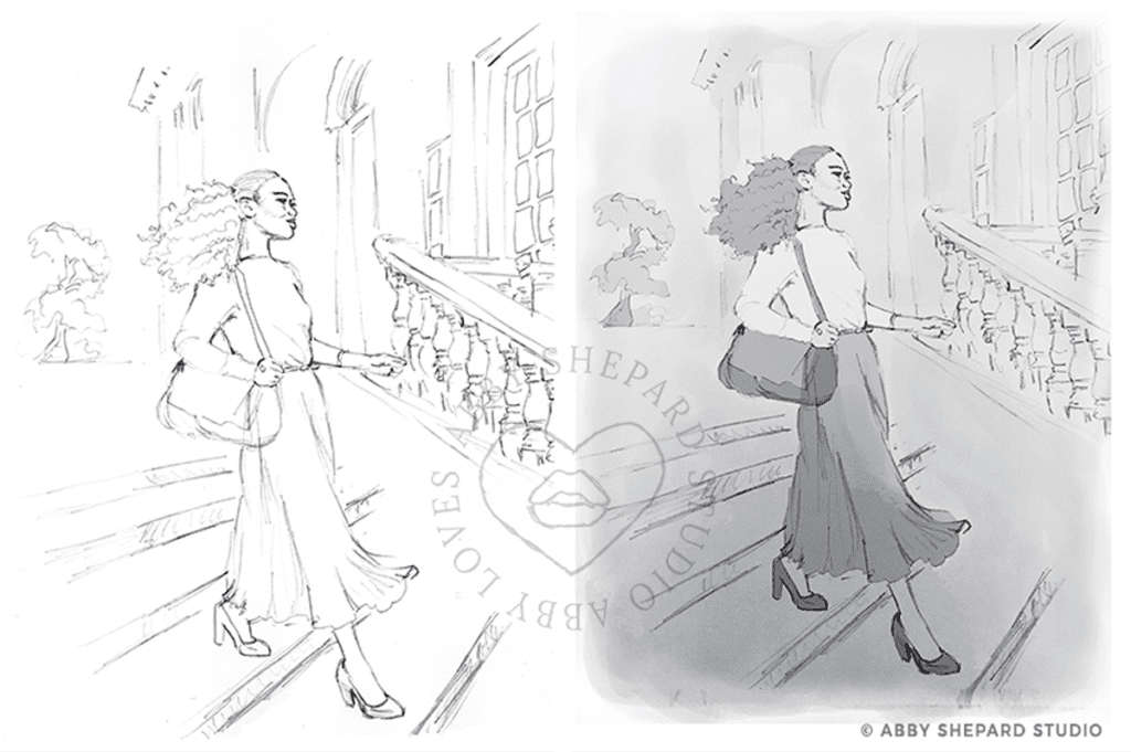
This spring I had the good fortune of being introduced to Myriam Michel, by a good friend and client, Nicole Guilmartin. Both ladies happen to be rock star event producers in the Boston area, and Myriam was looking for a custom illustration for a party invite. She’d seen an illustration I’d done a few years back for the The Power of the Purse Gala (a much cherished piece to this day) and the vision of that ‘lovely lady’ had stayed with her. So, when the opportunity arose, she gave me a call and I couldn’t have been more pleased to make her acquaintance!
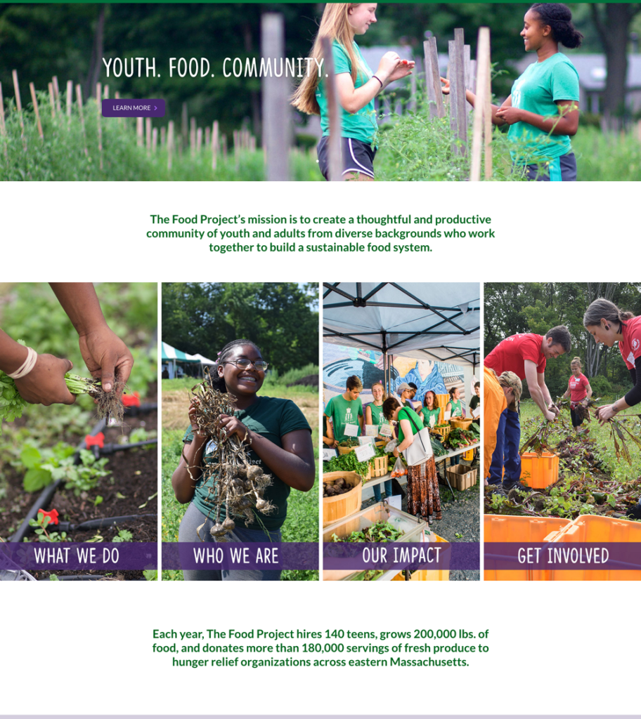
The image would be used for a Save-the-Date & Formal Invitation for The Food Project’s re-imagined fundraising event, the Shindig at Baker Bridge, and would take place at Baker Bridge Farm this September in Lincoln, MA. This event raises money to benefit their youth development and food systems change goals. In other words, it helps provide healthy fruits and vegetables to families and communities – while also offering educational food programs to teens. Amazing! I was thrilled to be a part of the team.
She described her vision of the event, and it began to take shape in my mind. I pictured a lively garden party surrounded by fields and flowers with a gathering of warm, welcoming faces in a celebration of bountiful nature on a dreamy, sunny afternoon. Laughter and frivolity, along with meaning and purpose. A setting both casual yet festive to showcase the farms beauty, while also capturing guests mingling, sipping libations, noshing small bites, exploring the property, and an overall joyful atmosphere of community. I could see it coming to life.
She looped Heath Marlow, Director of Director of Donor Engagement for The Food Project into the conversation, and from there things really took off. With everyone familiarized, the last thing to do before putting pencil to paper, was to make sure I had the details right; to extrapolate what was inside their minds – which is really the most important part of creating a custom piece for anyone. Getting that on point takes some Q&A at the start, but always makes the work so much better.
COLLABORATION:
So much happens at the front-end of a project. Playing detective and being highly curious is part of the fun – and I loved working with both Heath & Myriam to uncover their vision. They’re wonderful collaborators – positive, enthusiastic and open to sharing – which makes everything easier!
I was curious to know everything… Did they see the setting from a distance, like an aerial view of the party or was it close-up and cropped in on faces/details? Did they want iconic, notable, and realistic details included from the farm or was it to be more abstract to capture more of the ‘idea’ of the location? What time would the party be (day/night/dusk)? Would it be families, small children, farm animals – or is it more of an adult social event sans children or animal attendees? What would be some of the party details (food/wine/attire/décor)? And finally – who were their guests? What might they they be wearing and who is part of their community? How would the piece of art be used – print, digital, postcard or other? And at what size?
They visualized a lively afternoon party taking place on the farm seen from a distance in a wide open space surrounded by rows of crops, flowers, trees – perhaps a few iconic pieces from the farm like a large tree and wooden bench, in lush green tones on a sunny day to include a party tent, tables, some hints of food/wine and perhaps children and other fun, farm details. I loved it and with all the questions answered, the first-round of sketching was underway.
CONCEPT SKETCH #1
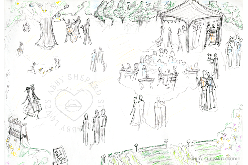
Before making the first mark, I researched the farm and any images I had as reference. I searched for farms and garden parties that I thought mirrored the idea. I sat in the garden outside and watched the light and considered the space and color with eyes closed and began to really envision what should be on the page.
The initial sketch usually looks pretty rough and messy, but there’s a lot of work that goes into it. It’s meant to be a map that merely suggests what’s to come. I shared it with Heath & Myriam to see if this was similar to what they were picturing (the view of the farm, the people and details, children chasing ducks, the wooden bench, etc) to makes sure I was on the same page with them before moving on. And it turns out, I wasn’t.
Upon seeing the sketch, they realized they had something different in mind. They their words, they were looking to ‘see a more zoomed-in version, prioritizing the energy of the people over the physical location‘, yet with the same party details and farm setting. They wanted to steer clear of anything specific to the farm, to stick with more of a general farm setting, while making sure to include teens but no small kiddies or duckies. Perfect! Moving onto the next version…
CONCEPT SKETCH #2
Changing the composition could have been significant, but we were clear on most of the details so it was just a matter of changing the perspective to have a closer view. With some subtle shifts in the placement and composition, the next version came to be. And it just felt right.
But before I could celebrate, Heath & Myriam would need to confirm it. And they did.
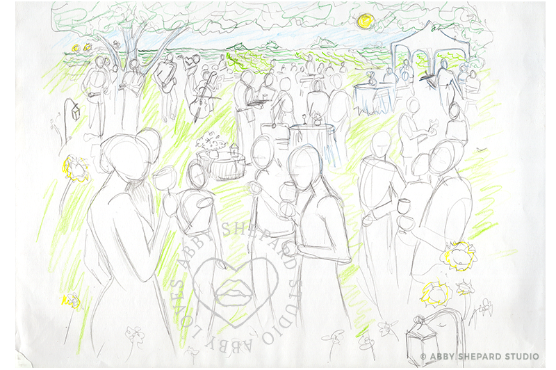
When I shared the 2nd version, they loved it. And yay! This sketch was more flushed out than the first to show more detail to the setting and guests – and I was so happy that they were also fans of take two. There was something so inviting about it. It really pulled you in while carrying your eye around the people and the party details. I couldn’t wait to get started on filling in the missing pieces and taking this to the next level.
Who would each person look like? What would they be wearing? Would they be holding a glass of wine, or each other? What types of flowers, tables, lanterns, trees? So many options to play with! And with the green light of approval, I could begin sketching.
Heath shared, “I even love how you’ve got the sun low in the sky, as I suspect that will lend to the kind of colors that help people imagine a late afternoon/early evening event in September.“ Which honestly I had not even thought of yet since I was so focused on getting the line drawing right. I had a loose idea for color, but I get to that later, so his mention of it was gold. It helped me see it through his eyes and gave me another piece to the puzzle.
We all agreed it should be super colorful but not only with the environment, but also in skin tones, with a variety of textures and styles. And they wanted to include a representation of young adults and people of all abilities with guests attire being a mix of sundresses, summer suits and upscale, yet casual attire – A farm-fancy, garden party!
INSPIRATION
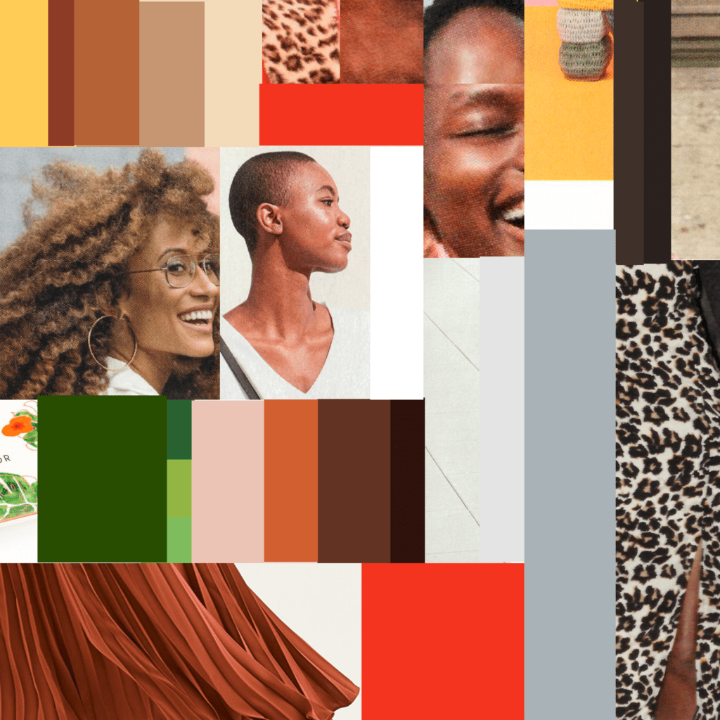
There was so much to choose from and I wanted to incorporate as much as possible. In skin tones and hair, I wanted a wide range of hues from black, brown, and copper, to red, sand, peach, mustard and nude.

And for the setting, I wanted lush, deep greens in a range of tones from evergreen to teal – and lots of vibrant colors like magenta, violet, sunflower and cyan to really offset the background and make it pop!

But before I could do anything with the color palettes, I needed to get a drawing done.
ARTIST DESIGN NOTE
This turned out to be a particularly fun project with more variations than I normally would do. It’s fascinating to share the transition of this composition to show how much it changed from start to finish – while so much of the initial concept staying intact. In the end, it’s even a surprise to me how the ‘happy accidents’ are really what make this piece truly special. Little creations tend to have a life and personality of their own that play a part in their own evolution to get where they need to be. It’s a magical mystery. See if you can find the changes as you scroll through. I’ll give you a hint… it’s the guests.
COMP #1
COMP #2
COMP #3
COMP #4
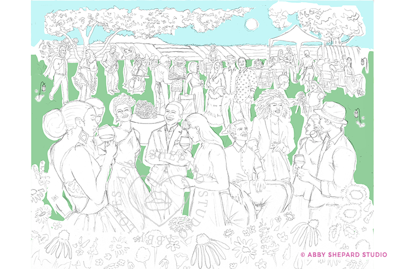
COMP #5 – FINAL VERSION
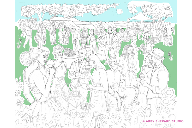
PROGRESSION OF COMPS
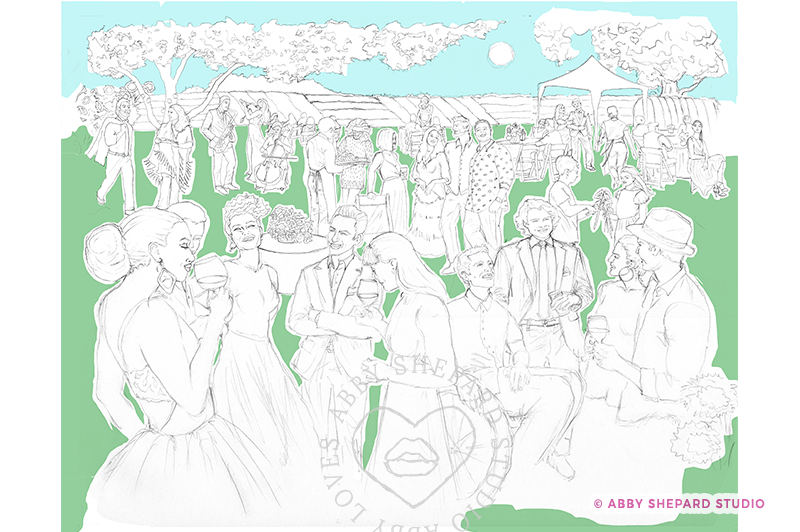
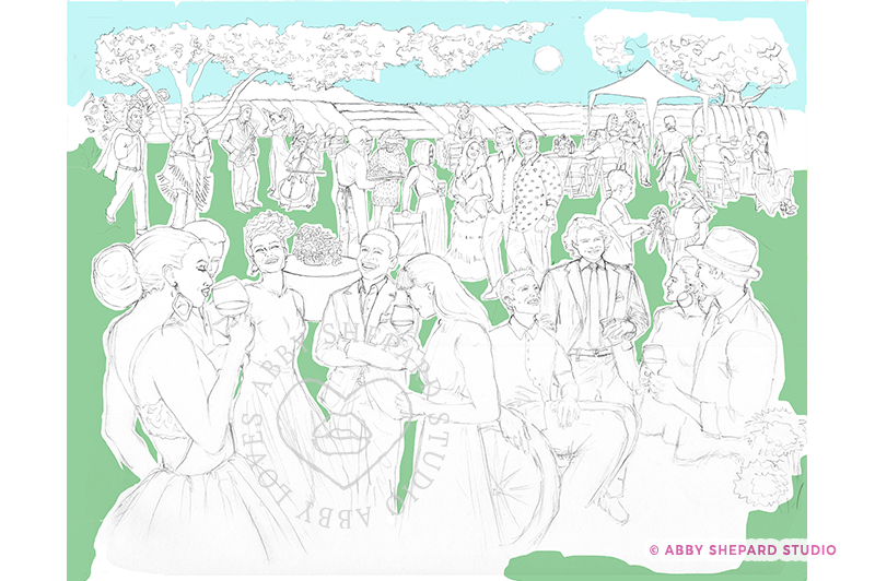
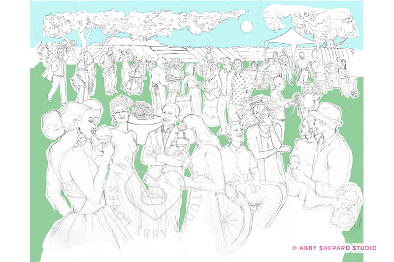
What you’ll notice as you view the comps is the people change or move around. I prefer to work in traditional media because of the feel of pen to paper, and how it’s a very meditative and pure experience for me. Free of distractions, notifications, pop-ups or screens. However, being able to work digitally, is a saving grace and one that is quite liberating. Knowing that I don’t need to be perfect, that I can change pretty much anything I want to is freeing and it allows me to really let go and play with the process.
In the 1st Comp, I wasn’t crazy about the grouping so I replaced a gentlemen in the front in the next version, Comp 2. But then I thought the other grouping was off, so I replaced a guy with a very happy lady. But then, she wasn’t quite right either, so I replaced her with a different woman who I thought was fabulous and really added something strong to the composition. And then received a request for ‘braids’ from Myriam which turned out to be exactly what was missing… a new hairstyle. Who knew?! But it sealed the deal and the drawing was done!
THE FINAL VERSION IN COLOR
Well here she is in all of her colorful glory and there’s so much to talk about. I want to fall into this picture and get to know everyone. Walk around the beautiful field while listening to the musical trio. Feel the warm, setting sun on my face while hearing laughter and friendly conversation. Sip some wine with the wafting aroma of wildflowers all around me as I admire everyone around. How dapper they all look and what style. They’re all so interesting and inviting!
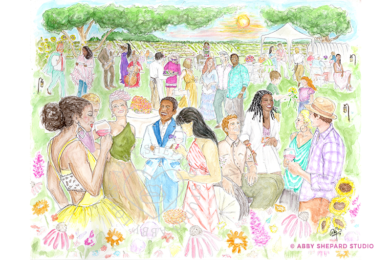
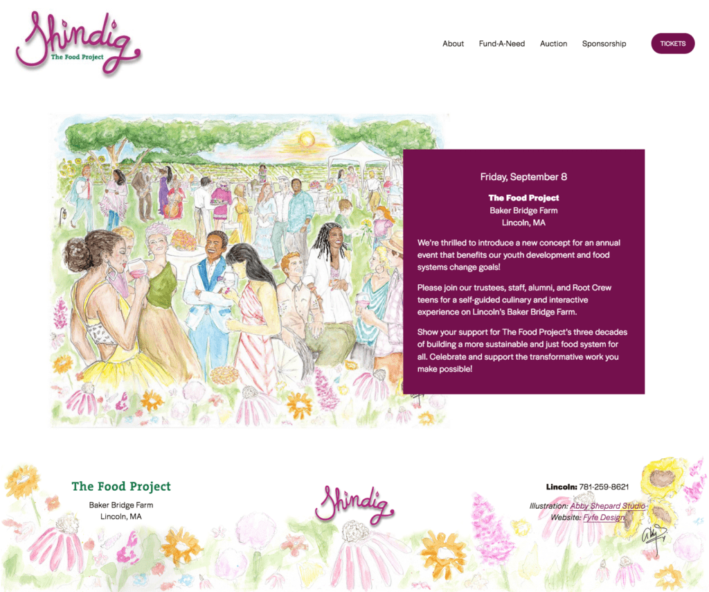
I want to be there! Usually when I draw something, it’s not a real place you can go, but this time, it actually is. How amazing is that. This party will be happening on Friday, September 8th at the Baker Bridge Farm in Lincoln, MA. I’ve included a link to the event page below and I highly recommend you check it out if you’re not familiar with this essential nonprofit organization, The Food Project. They’re doing great things and paying it forward.
If you can’t attend, you can support them in other ways by making a donation or better yet, bidding on one of their silent auction items in honor of the event. They’ll be offering a limited amount of these prints on beautiful museum quality watercolor paper, that I’ll be customizing by hand so each is an original, one of a kind piece for your collection. Each will come with an artists statement of authenticity, and a private note thanking you for your support of The Big Shindig. I hope to see you there!
Get in touch if you have any need for a custom illustration for an upcoming event, an invitation or if you’re interested in a custom print or piece of artwork. I’m always open to collaborate on a new project.
Feel free to leave any comments – would love to hear what you think!


